

Last Updated: October 27, 2026
Quick Summary
To curate a personal art style, start with a style audit: list ten works you wish you had made, then name the repeated visual choices in line, color, shape, and composition. Build a mood board capped at 20-30 images, extract one usable rule from each, and test one rule per week on your own subjects.
- A personal art style is the set of repeated visual choices an artist makes without thinking about them.
- Cap your art style mood board at 20-30 images; beyond 30 it stops being readable.
- Run one exercise track at a time, since stacking all five at once leads to burnout.
- Lock three anchors, one palette family, one line habit, one shape bias, and let subject and medium vary.
- When adapting style to a job, adjust value contrast first, line weight second, detail density last.
Table of Contents
- Start With a Style Audit, Not a Blank Page
- How to Find Your Art Style by Naming What You Already Like
- Build an Art Style Mood Board You Will Actually Use
- Art Style Exercises With Timelines and Checkpoints
- Borrow From Influences Without Copying Anyone
- How to Keep a Consistent Art Style Across Subjects and Formats
- Put Your Style on the Wall (and On Your Back)
- Frequently Asked Questions
Start With a Style Audit, Not a Blank Page
Most people try to invent a personal art style from nothing. That is the hardest possible starting point. A style audit works better: you look at what you already love, then name the patterns hiding in plain sight.
A personal art style is the set of repeated visual choices an artist makes without thinking about them. Those choices show up in line quality, shape language, color palette, composition, and subject matter.
List the Ten Works You Wish You Had Made
Open a notebook and write down ten pieces of art you wish were yours. Not ten you admire. Ten that make you feel a small, envious ache.
Do not filter. A Klimt portrait, a friend's sketchbook page, a movie poster, a tattoo design all count. Then look for repeats:
- Which subjects show up more than once?
- Which colors keep returning?
- Do the works feel quiet or loud, dense or airy?
The answers are your first real data. A common mistake is choosing works that feel "impressive" instead of works that feel like you. Be honest. The envy is the signal.
How to Find Your Art Style by Naming What You Already Like
Finding your art style starts with language, not drawing. Vague admiration keeps you stuck. Precise description gives you something to build on.
Try this method on three of your ten works. For each one, finish these sentences:
- "The line here is ______." (loose, tight, scratchy, smooth, broken)
- "The color feels ______." (muted, electric, dusty, warm, cold)
- "The shapes are mostly ______." (round, angular, elongated, blocky)
- "The composition makes my eye go ______ first."
- "The texture looks ______." (flat, grainy, layered, glossy)
Now read your five answers across all three works. The words that repeat are your visual identity forming.
You are collecting evidence, not vibes. If you want a deeper read on why curated choices beat mass-produced ones, our piece on why curated home decor beats mass-produced makes the same case for your walls.
Build an Art Style Mood Board You Will Actually Use
An art style mood board is a working reference system, not a gallery. Most mood boards fail because they collect images without extracting anything from them.
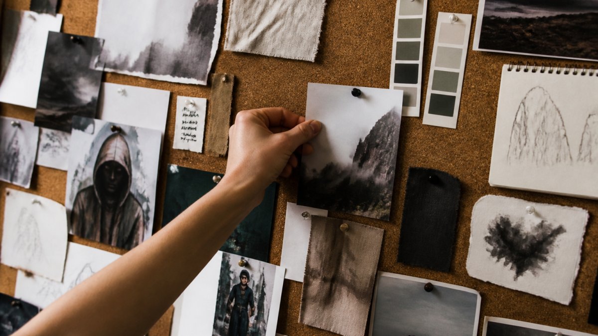
Run the Board as a Four-Stage Workflow
Instead of pinning images and hoping patterns emerge, move each reference through four stages:
- Collect. Save 20-30 images that produce the envious ache from your style audit. Cap it there; a board over 30 images stops being readable.
- Extract. For each image, write one sentence naming a single transferable quality: "broken 2px line weight," "three-color palette with one saturated accent," "low horizon with 80% sky." If you cannot name a quality, remove the image.
- Cluster. Group the extracted notes, not the images, into line, color, shape, texture, and mood. The fullest cluster is your natural bias; the emptiest is your next experiment.
- Test. Pick one extracted rule per week and apply it to your own subject. Keep the rule only if it survives contact with your hand.
This is the difference between a board you look at and a board you use.
Extract Qualities, Not Artists
The practical method for analyzing influences is to describe the mechanism rather than the maker. For any reference, answer three questions in plain language:
- Shape language: Are the dominant forms round, angular, elongated, or blocky? What is the ratio of curves to straight edges?
- Line quality: Is the line uniform or variable? Does it taper, break, or stay mechanical? What weight range does it use?
- Palette structure: How many hues? Is contrast carried by value or by saturation? Is there one accent color doing most of the work?
Write the answers as rules you could follow without the original in front of you. "Soft rounded shapes with one sharp accent" is a rule. "Like that artist" is not. Rules are what let you borrow a quality and apply it to a completely different subject, which is the ethical core of influence covered later in this guide.
Sort Your Board by Visual Choice, Not by Artist
Group your extracted notes by decision, not by name. Make columns or piles labeled:
- Line: thin, thick, sketchy, clean
- Color: limited palette, full spectrum, high contrast, low contrast
- Shape: geometric, organic, mixed
Now step back. Which column is fullest? That is your natural bias. Which column is emptiest? That is where experimentation should go next. A board sorted by artist tells you who you like. A board sorted by choice tells you what you do, and that is the only thing you can build a style on.
Art Style Exercises With Timelines and Checkpoints
Art style exercises work best with a clock and a checkpoint. Open-ended practice drifts. A short deadline forces decisions, and decisions are what build a drawing style.
| Exercise | Time per session | Frequency | Checkpoint |
|---|---|---|---|
| 10-minute single-subject sketches | 10 min | Daily, 2 weeks | 14 sketches done, note which felt easiest |
| Same subject, three mediums | 30 min | Twice a week, 3 weeks | 6 versions, circle the one you liked most |
| Limited palette study | 20 min | 3 times a week, 2 weeks | 6 studies using 3 colors only |
| Master study, one detail only | 25 min | Weekly, 4 weeks | 4 studies, list 2 choices you kept |
| Blind contour warm-up | 5 min | Before every session | Looser line quality over time |
Run one track at a time. Stacking all five at once leads to burnout, not growth. The 10-minute sketch track is a starting point.
Cezanne's Clarinet Canvas Gallery Wraps →
Check your work at each checkpoint. Ask two questions: What did I do without thinking? What did I have to force?
Borrow From Influences Without Copying Anyone
Borrowing and copying are different acts. A master study is borrowing: you copy a work to learn how it was built, then you make something new.
The ethical method is simple. Study one specific choice at a time:
- Copy only the color palette, then apply it to your own subject.
- Copy only the line weight, then draw something entirely different.
- Copy only the composition, then change the subject and palette.
Never reproduce a living artist's work for sale or portfolio use without permission. Credit your influences when you share studies. That habit protects you and shows respect.
Watch out: posting a traced or near-identical copy as original work can damage your reputation fast, and in commercial use it can create real legal exposure under U.S. Copyright Office guidance on derivative works.
Seeing how one artist channels an influence into original work helps here. Our O'Keeffe-inspired tidepool matte poster takes a known style and pushes it into new territory rather than repeating it.
How to Keep a Consistent Art Style Across Subjects and Formats
A consistent art style holds together because the same visual choices repeat, not because the subject stays the same. You can draw a portrait, a landscape, and a product and still look like yourself.
Pick three anchors and keep them fixed:
- One palette family you return to often, defined by hue count and contrast structure rather than exact colors
- One line habit, such as a slightly broken edge or a confident thick outline, defined by weight range and taper
- One shape bias, such as rounded corners or elongated forms, defined by the ratio of curves to straight edges
Then let subject, medium, and format change freely. Our Canvas Wall Art Abstract Ibis Vortex shows how one visual language can carry across subjects and formats consistently. Consistency comes from the anchors.
Stress-Test the Anchors on Unfamiliar Subjects
Consistency is easy when you draw what you always draw. It breaks when the subject fights your habits, a highly detailed architectural scene against a loose line habit, or a soft organic subject against a geometric shape bias. Run a deliberate stress test:
- Choose a subject outside your comfort zone: hands, machinery, foliage, fabric folds.
- Draw it three times, each time protecting one anchor while letting the other two loosen.
- Compare the three. The version that still reads as yours tells you which anchor is doing the real work.
Carry the Style Between Traditional and Digital Media
Switching tools is where many artists feel their style evaporate. The anchors survive the switch if you translate them as rules rather than as settings:
- Line: a broken traditional edge becomes a brush with pressure sensitivity and a slightly jittered stabilizer setting, not a clean hard round brush.
- Palette: a limited traditional palette becomes a locked set of swatches and a value-check layer, not an open color wheel.
- Texture: paper grain becomes a scanned texture overlay or a grain brush at low opacity, not a flat fill.
Build a small "translation sheet" for each medium you use, one page listing how each anchor shows up in that tool.
Adapt the Style to the Job Without Losing It
Personal expression and readability can coexist. A style tuned for a gallery wall and a style tuned for a thumbnail, a commission brief, or a portfolio page are the same voice at different volumes. Adjust in this order:
- Value contrast first. Readability at small sizes is mostly a value problem, not a color or line problem.
- Line weight second. Thicken the smallest lines until the piece survives being viewed at phone size.
- Detail density last. Cut the smallest details before you cut the anchors.
Put Your Style on the Wall (and On Your Back)
Your style does not have to stay in the sketchbook. Once you can name your visual choices, you can apply them to what you wear and what hangs in your home.
Start with your walls. Our Waves and Daffodils canvas gallery wrap, in the style of Van Gogh, gives you a bold, textured reference point at $37.19. Every wrap uses 100% cotton fabric at 400gsm with a patented solid support face, and is for indoor use.

Then take it to your wardrobe. If you are building a wearable version of your style, our guide to building a creative capsule wardrobe gives you a practical framework. And if you are wondering whether artistic apparel is worth the higher price, we explain why curated artistic apparel costs more before you commit.
Frequently Asked Questions
How long does it take to develop a personal art style?
Set a checkpoint every two weeks: lay out everything you made and circle the choices that repeat. Those repeats are your style forming.
Can an artist have more than one art style?
A consistent art style does not mean one rigid look forever; it means your choices stay recognizable within a body of work. Pick the lane before you start a piece, and keep your line quality, palette, and shape language steady within it.
How do I use inspiration without copying another artist?
Analyze the influence instead of reproducing the image. Take one artwork you love and write down three specific choices: the line weight, the color palette, the way shapes are simplified. Then apply only those choices to a subject the original artist never drew. If your result still reads as their piece, you borrowed too much at once. Credit your influences when you share studies publicly.
What should I include in an art style mood board?
Label each image with the visual choice you are drawn to: the texture, the palette, the composition, the mark-making. Mix sources beyond art, such as fabric patterns, film stills, and packaging. Group the images by choice rather than by artist. Revisit the board and remove anything you no longer respond to.
Curating a personal art style takes patience, and the hardest part is trusting that your repeats are enough. That is the work we care about at MobiusLDG. Our collection of unique graphic tees, canvas prints, and accessories is built for people who want their taste to show. Every piece is artfully cast from dreams, made from designs we genuinely love. Browse the featured selection, find the canvas or tee that matches the palette you just named, and get started with MobiusLDG today.
