

Last Updated: October 24, 2026
Quick Summary
Mixing art with decor starts with reading the room before you shop: match the art's undertones and energy to your rug, sofa, wood tones, and available wall space. Then choose pieces by size, subject, feeling, and fit, aiming for art about two-thirds the width of the furniture below it.
- Treat wall decor as the last layer of a room, not the first.
- For a standard 84-inch sofa, aim for art about 56 inches wide.
- Let one style lead at roughly 70% and add contrasting accents.
- Keep gaps between frames consistent at around 2 to 3 inches.
- Center art at eye level, roughly 57 to 60 inches from the floor.
Table of Contents
- Start With the Room, Not the Art
- How to Choose Wall Art for Your Home
- How to Mix Art Styles in One Room
- Match Color Palettes Without Matching Everything
- How to Arrange Mismatched Artwork
- How to Create a Gallery Wall That Holds Together
- Scale, Height, and Spacing: The Numbers That Matter
- Pick Your First Print and Plan the Wall
- Frequently Asked Questions
Start With the Room, Not the Art
Most people buy a print they love, hang it, and wonder why it fights the sofa. The fix starts before you shop. Mixing art with decor is really a lesson in reading the room first.
At MobiusLDG, we think of wall decor as the last layer of a room, not the first. Look at what's already there:
- The dominant colors in your rug, sofa, and curtains
- The wood tones in your furniture and floors
- The room's mood: calm and neutral, or bold and busy
- How much empty wall you actually have
A room with warm wood and cream walls wants art that shares those undertones. A white box apartment can take louder color. Match the room's temperature and energy, and almost any style will land.
How to Choose Wall Art for Your Home
Choosing wall art for your home comes down to four filters: size, subject, feeling, and fit with what's already in the room. Get those right and the style matters less than you think. Most people skip the fourth filter, which is why a piece they love in the store can feel wrong on the wall.
Start with size, and use the wall, not the frame. A small print on a big empty wall looks lost. Measure the available wall width, then aim for art that fills roughly two-thirds of the width above a sofa or console. For a standard 84-inch sofa, that means a piece or grouping about 56 inches wide. On a narrow wall, a single vertical piece often works better than a horizontal one that crowds the edges.
Match the subject to the room's job. A landscape, an abstract, a hummingbird: the theme should echo what the room is for. Calm subjects suit bedrooms. Bolder pieces wake up a hallway. In a dining room, food, botanical, or still-life subjects feel at home; in an entryway, a strong graphic or a mirror-adjacent piece gives the eye somewhere to land when you walk in.
Check the feeling against the room's energy. Stand in the room and ask what it needs: more energy, more quiet, or more color. A neutral, low-contrast room can carry a louder piece; a busy room with patterned wallpaper or a bold rug needs art that calms rather than competes.
Then check the fit with existing decor. This is the step most guides skip. Before you buy, pull one or two colors from the rug, sofa, or curtains and look for art that shares them. Match the wood tone of your frames to the room's dominant wood, or deliberately contrast it.
If you're ready to start shopping, you can browse artistic wall art online and filter by mood and size. Order the anchor piece first, live with it for a week, and add the smaller pieces once you see how the room responds.
How to Mix Art Styles in One Room
Mixing art styles in one room works when one style leads and the others follow. Pick a dominant style for about 70% of the pieces, then add accent pieces in a contrasting style. A clean modern room can take one pop art print. A traditional room can handle a single abstract.
The trick is a shared thread. That thread can be:
- A repeated color across every piece
- The same frame finish throughout
- A common subject, like animals or botanicals
- Matching mat widths
Without a thread, a mix reads as clutter. With one, it reads as a collection. If you want curated options built for modern spaces, our guide to curated art prints for modern homes shows how to build that thread.
Match Color Palettes Without Matching Everything
Color coordination does not mean matching every hue. Pull one or two colors from the room and repeat them in the art, then let the rest contrast.
Here's a simple approach we recommend:
- Choose a dominant room color and find art that shares it
- Add one accent color that appears in both the art and a small decor item
- Let neutral pieces breathe between the colorful ones
Too much matching looks flat. A little contrast creates visual balance. If your sofa is deep green, art with a touch of green plus warm rust or gold will feel intentional rather than copied.
How to Arrange Mismatched Artwork
Arranging mismatched artwork starts with a floor layout before a single nail goes in. Lay every frame on the rug and move pieces until the group feels balanced. This saves holes and headaches. But the floor layout is only step one; the rest is measurement and a plan you can test before you commit.
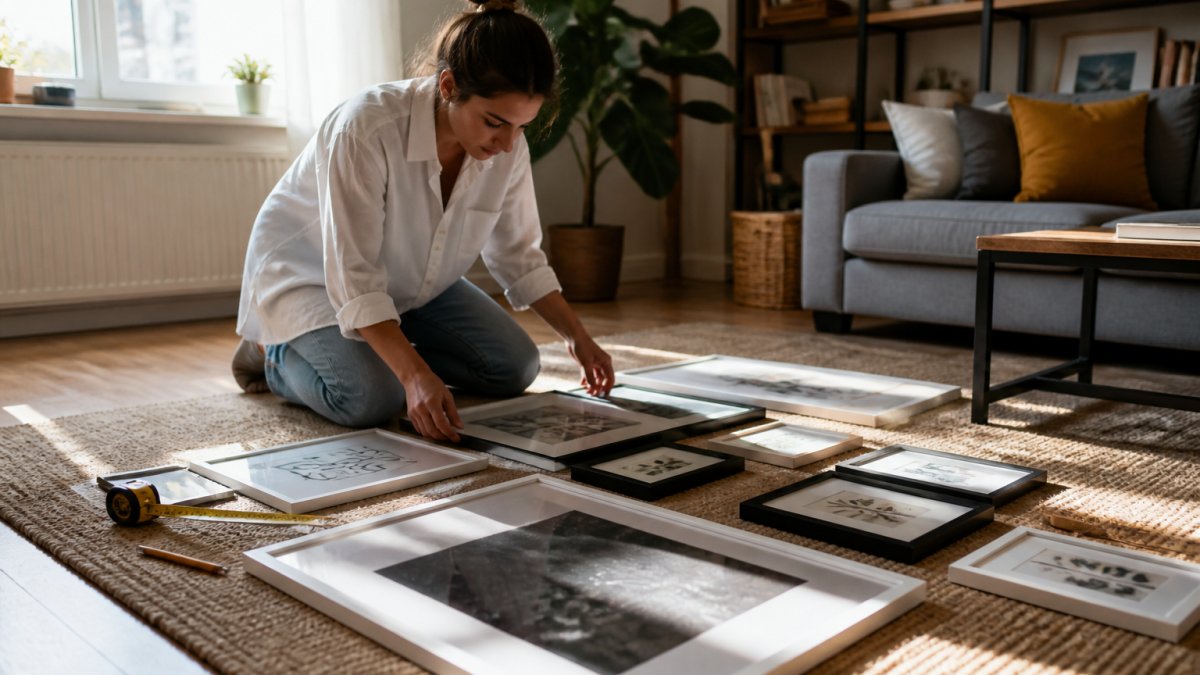
Build the layout in four passes.
Hummingbird Canvas Gallery Wraps →
- Anchor. Place the largest or boldest piece first, slightly off-center rather than dead center. Everything else relates to it.
- Balance. Balance a large piece with two or three smaller ones. A heavy piece on one side wants visual weight on the other, a darker frame, a denser subject, or a tighter cluster.
- Rhythm. Mix horizontal and vertical orientation. Alternate dense and airy pieces so the eye moves instead of stopping.
- Edges. Align at least one edge or centerline across the group. A shared top line, bottom line, or vertical centerline is what makes a mixed group read as intentional.
Use the numbers. Keep gaps between frames consistent, around 2 to 3 inches. Center the group at eye level, roughly 57 to 60 inches from the floor to the middle of the arrangement. Above furniture, leave 6 to 8 inches between the lowest frame and the sofa or console. Symmetry feels formal; asymmetry feels relaxed. Pick one and commit, a group that is almost symmetrical reads as a mistake, while a clearly asymmetrical group reads as a choice.
Test it before you drill. Tape paper cutouts to the wall in the exact footprint of each frame and live with them for a day. Check the layout from the doorway, from the sofa, and from across the room. You'll catch problems, a piece that crowds a light switch, a gap that looks fine up close but reads as a hole from ten feet away, before the drill comes out. For renters or anyone unsure of the final arrangement, removable adhesive strips and picture-hanging hooks that leave a small nail hole are a practical middle ground; check the weight rating on the package against the weight of the frame.
For deeper display ideas, see our guide on the best ways to display art prints.
How to Create a Gallery Wall That Holds Together
A gallery wall holds together when the frames and spacing do the unifying, not the artwork. Treat the wall as one big composition and the individual pieces as parts of it.
Start with a focal point: the largest or boldest piece, placed slightly off-center. Build outward from there. Keep frame styles to two at most, and repeat mat colors so the eye has somewhere to rest.
A quick checklist before you hang:
- One anchor piece chosen
- Frames limited to two finishes
- Consistent spacing mapped out
- Layout taped on the wall and checked from across the room
That last step matters. Tape paper cutouts to the wall and live with them for a day. You'll catch problems before the drill comes out.
Scale, Height, and Spacing: The Numbers That Matter
The numbers do most of the work in a good hang. Center art at eye level, roughly 57 to 60 inches from the floor to the middle of the piece. Above furniture, leave 6 to 8 inches between the frame bottom and the sofa or console.
| Rule | Measurement | Why It Works |
|---|---|---|
| Hanging height | 57-60 in to center | Meets the eye naturally |
| Above furniture | 6-8 in gap | Ties art to the piece below |
| Frame spacing | 2-3 in between frames | Keeps groups readable |
| Art width over sofa | About 2/3 of sofa width | Fills the wall without crowding |
Small apartments need extra care here. Tight spaces reward vertical stacks and fewer, larger pieces. Our ideas for artistic home decor for small apartments put these numbers to work in compact rooms.

Pick Your First Print and Plan the Wall
You now have the rules. The last step is choosing a piece and mapping where it goes before you buy.
Start with one anchor print. A canvas gallery wrap is a forgiving first choice because it arrives ready to hang with no frame decision required. Our Hummingbird Canvas Gallery Wrap comes in multiple sizes and orientations, so you can match it to your wall measurements from the section above.
Then plan the wall:
- Measure the wall and note the eye-level line
- Tape the planned footprint on the wall
- Order the anchor piece first
- Add smaller pieces once the anchor is up
Watch out: buying a full set at once often leads to a wall that feels too matched. Build gradually and let each piece earn its spot.
Frequently Asked Questions
What is the 2/3 rule for hanging pictures?
The 2/3 rule says art should span roughly two-thirds of the width of the furniture below it, such as a sofa or console. A 72-inch sofa pairs well with a piece or grouping about 48 inches wide. This keeps art from looking lost above large furniture or overpowering small pieces. Measure the furniture first, then size your frame or gallery layout to that two-thirds target before you buy.
How do you make mismatched artwork look cohesive?
Tie mismatched pieces together with one shared element: a repeated frame color, a common mat width, or a color that appears in every piece. Keep hanging height consistent, with centers around 57 to 60 inches from the floor. Grouping pieces close together, usually 2 to 3 inches apart, also reads as one collection rather than scattered singles. A canvas gallery wrap like the Hummingbird Canvas Gallery Wraps, $26.36, can anchor a group of framed prints without adding another frame style.
How do you mix art with decor that is already in the room?
Pull one or two colors from your existing rug, pillows, or upholstery and look for art that repeats them. Mixing art with decor works best when the artwork echoes the room instead of competing with it. If the room is neutral, one bold print adds contrast. If the room is busy, choose calmer pieces with more negative space. Matte posters such as the Planetary Home Matte Poster, $13.38, are an affordable way to test a color direction before committing to larger pieces.
How high should I hang art on a wall?
Hang art so the center of the piece sits 57 to 60 inches from the floor, which is average eye level for most adults. Above furniture, leave 6 to 8 inches between the top of the sofa or console and the bottom of the frame. In a gallery wall, keep spacing between frames to 2 to 3 inches so the group reads as one unit. Measure and mark with painter's tape before drilling any holes.
Mixing art with decor is a skill you build one wall at a time, and the right pieces make it easier. MobiusLDG curates art and apparel that carry a dream-like, personal feel, from canvas gallery wraps to graphic tees. Explore our collection, find a piece that speaks to your room, and subscribe to our emails for new drops and styling ideas.
